


A 404 error page is a page that is presented to a user when they try to access a page on a website that doesn’t exist.
When you are designing a website you need to keep the user in mind at all times, and you need to remember that you are taking them on a journey.
Sometimes when we’re on a journey we’ll take a wrong turn and end up at a dead end. And in the case of websites, a dead end is an error page.
But we do not want the error page to be the end of the user’s journey. The purpose of this page is not just to inform the visitor that the page they are looking for doesn’t exist; it’s to help the user get back on track so they can continue with their journey.
In this post I’m going to share my tips for designing strategic 404 error pages.
Start with a clear error message
First things first, you need to have a clear message that tells the visitor that the page they are looking for does not exist.
I recommend that you don’t just display a message that says “404 error” as not everyone is technically literate and will know what this means.
Inform the user that the page they are looking for could not be found. You might want to stick with the basic “Sorry, page not found” message, or go for something more creative and fun.
Bonus points if you can make the error message relevant to the business, like the 404 page on the KonMari website:

The message on the error page reads “We’ve been tidying up – and we let go of this page with gratitude.” which is perfect as Marie Kondo is a professional organiser who encourages you to be grateful for every item you let go of.
Use call to action buttons
So a visitor has landed on the error page; what’s next?
In order to keep their journey going, you might want to add some call to action buttons to the error page to direct website users somewhere else. The most common link I see on an error page is a link to the home page, but it can be a good idea to link visitors to other areas of the website that you think they would be interested in.
For example, on the error page on Tripadvisor they have links to the Hotels, Restaurants and Things to Do pages on their website:

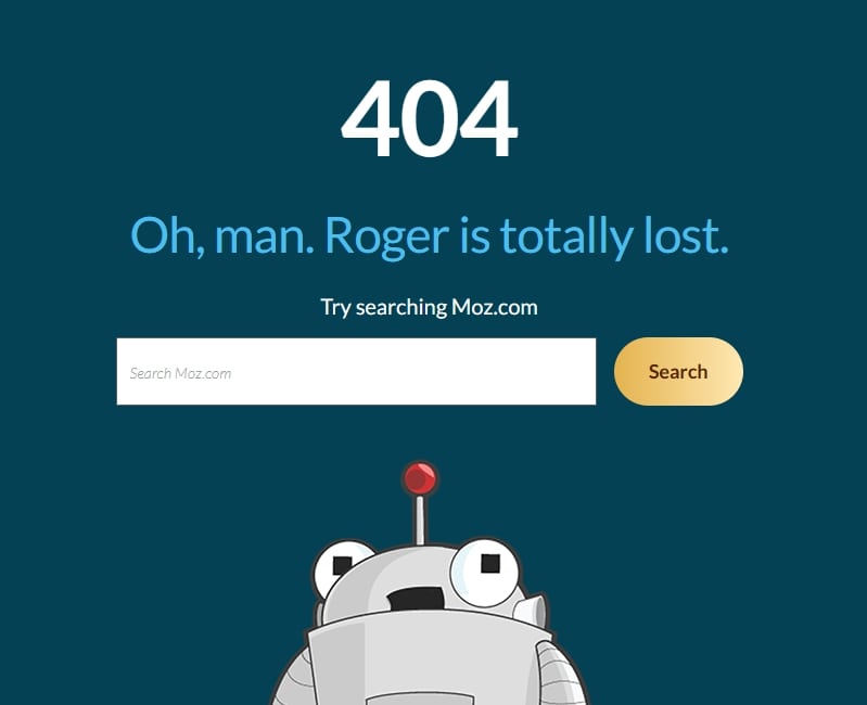
Add a search form
Displaying a search form on an error page can be a great way of encouraging visitors to continue their website journey, particularly if the website has a lot of content like a blog or an eCommerce store.
Visitors can use the search form to find exactly what they’re looking for rather than clicking on a call to action link.
Here’s an example of a simple yet effective error page with a search form on Moz.com:
And if you do add a search form to an error page, make sure you have designed a search results page too!
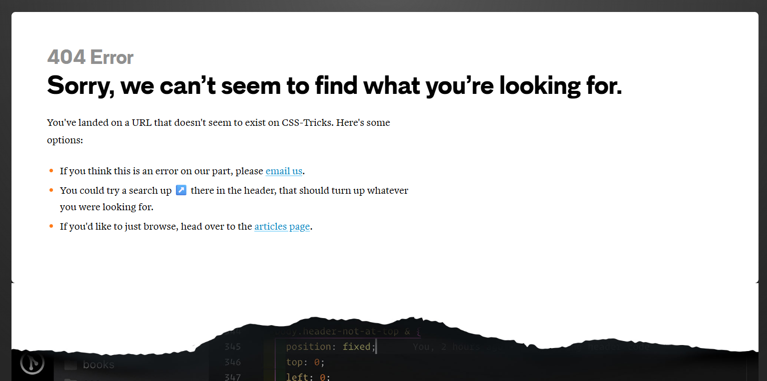
Ask the user for help or feedback
You might want to give visitors the opportunity to let the website owner know that they have landed on the error page and that they think it might be a mistake.
A simple line of text and a mailto link at the end of the error page is more than enough, and it just gives visitors an easy way to contact the website owner about the issue.
On the error page on the CSS Tricks website there’s a link that says “If you think this is an error on our part, please email us.” with a mailto link so that you can quickly and easily email them.
Honestly, most website owners will be grateful that you took the time out of your day to let them know that you found an issue on your website. Especially as broken links are bad for SEO!
Have some fun!
Error pages don’t have to be boring!
Ending up on an error page can be a frustrating part of the user journey, so why not lighten the mood and make it a memorable experience for all the right reasons.
One of my favourite error pages is on the Innocent Drinks website. Their error page actually congratulates you for finding the error page, making it feel like an achievement rather than an inconvenience!
They then go on to talk about some of the funniest mistakes they’ve made in their business:

Next time you’re designing a website for a client, set aside some extra time to design an error page. Even a basic error page is better than nothing, but don’t be afraid to be creative and to think strategically.
Chances are your client won’t have even thought about the error page on their website, so providing them with a design will likely impress them!
Are you ready to outsource your website development?
If you’re a web designer who loves creating beautiful websites but hates the coding side of things, I can help!
I specialise in turning designs into fully-functioning WordPress websites that not only look beautiful but that are also functional, strategic and fast.
Learn more about collaborating with a developer
Join my free email community for regular insights into working with a web developer, advice for designing strategic websites, and other behind the scenes bits and bobs.


